Beyond transactional banking
We started with two assumptions about the bank’s wealthier everyday customers. Both were wrong.
Iteratively designing the Lloyds app’s first home for savings and investing.
Theme: customer experience
Role: Lead product designer
Status: SHIPPED
2022-23

Fig 01
Your Money at pilot (left) and the Save & Invest space it became (right).
The problem
In the bank’s 2024 figures, 2.5 million customers held around £190bn with the bank and produced a third of its retail income. Only a fifth of that money was invested. Their app was identical to everyone else’s.
The brief was a new area of the app for these customers, reached from the account summary. The proposition team wanted them to feel valued.
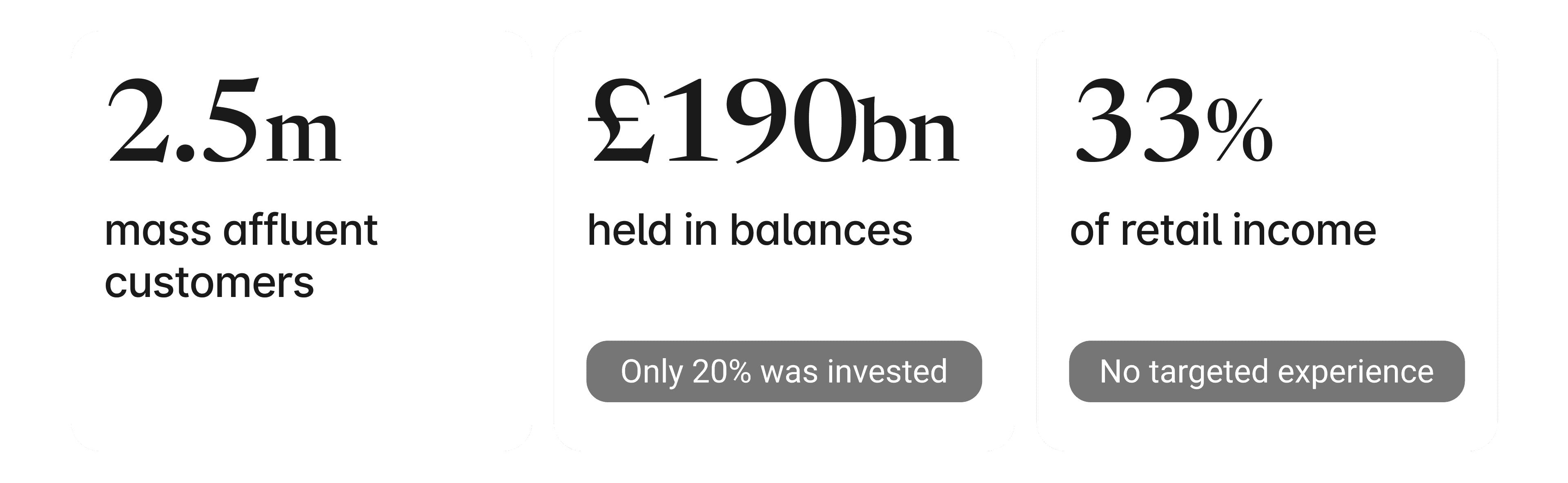
Fig 02
The opportunity, in the bank’s 2024 figures. Only a fifth of this money was invested.
My role / the team
I was lead product designer for two years, from first concept to public rollout. I owned the experience: the structure, six new components and every state. The proposition team owned the offer. The build was shared with the design system team, accessibility specialists and the delivery squad. After rollout, ownership moved to a new Save & Invest team.
I designed the wrong thing first
I designed what the brief seemed to ask for. Dark and gold, its own branded welcome, a £950k persona, eight fully designed versions of the hub.
It rested on two assumptions: that these customers expected a premium, branded experience, and that they had advanced financial needs. Neither held. We had no evidence they wanted a different-looking bank. The segment data split the group in two, high-income professionals and asset-rich older customers, with opposite service and guidance needs. Gold text on near-black, carrying money values, for a group that skews older, also failed on contrast.
I recommended piloting in the bank’s everyday design language, and the exec team made the call. A premium look would have added a variable the pilot couldn’t test. What we gave up was the visible signal of being special, which is what the proposition team had asked for.

Fig 03
The premium direction (A) against the bank’s everyday design language (B). Same content, different look. We had no evidence customers wanted A, and gold on near-black failed on contrast.
Reframing the problem
Critiquing our own first journey showed it worked for people already motivated to invest. It did nothing about the barriers in existing customer research: fear of losing money, “investing isn’t for people like me”, and not knowing how to start.
I changed the brief from “show people their investments” to “lower the barrier to starting”. I designed three directions against it: prompts in the everyday account view, content that built confidence before commitment, and nudges at moments of intent. The savings-vs-investing concept later became the Save & Invest calculator.

Fig 04
Three barriers from existing customer research. The brief moved from just showing investments to addressing these too.
The design
The app had never had to show wealth across products. What I designed included:
Entry point: a tab linking the account summary to the new area (built natively in the app)
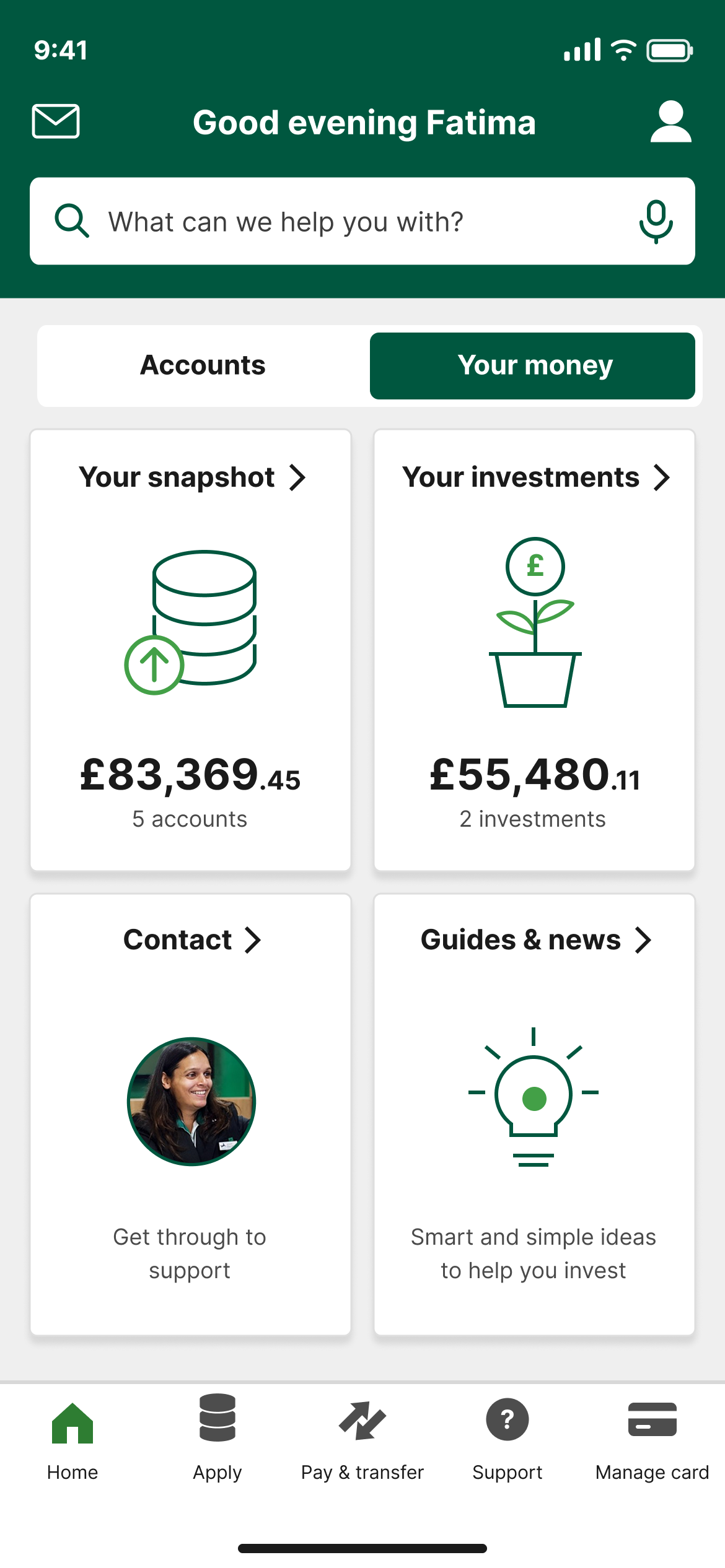
Your Money: the landing page for pilot customers
Your Snapshot: balances across products, with collapsible groups, group totals and a composition bar. Five states, including an error state
Your Investments: an aggregated view, with an error state for balances held outside the core banking system
Guides & news: three tabs sorted by investor confidence rather than topic, for people who don’t see themselves as investors
Contact: a fast-tracked queue for phone and chat
Accessibility shaped the details. Open or closed state is conveyed non-visually, each subtotal is tied to its group, and colour is never the only way categories are told apart in the bar.
One compromise: the hub views were web pages inside the app, which handle text resizing poorly and don’t support iOS Dynamic Type.
Challenging my own design
I tested my tab model against a lighter challenger: no tab, just a link in the account list. A tab takes permanent screen space, which costs most for people using large text.

Fig 06
Defender and challenger. My tab model against a plain link in the account list, both tested in the pilot.
The results
The pilot went to around 10,000 customers. Two results:
The tab version brought about three times as many people into the new area.
Around 60% of all interactions landed on one tile, Your Snapshot.
Based on this I kept the tabs and removed the Your Money hub, renamed the Your Snapshot to Save & Invest and brought the other features into it.

Fig 07
Pilot results on the screen: the tab (1) and Your Snapshot (2), where around 60% of interactions landed.
What shipped & what happened
It rolled out publicly in mid-2023. The tab is still in the app as Save & Invest, and it became the base for the savings calculator, savings goals and financial planning. The segment insight fed into the Premier account, which launched in 2025.
I can't share the conversion or investment-uplift figures. What I can show is the full loop: launched, measured, redesigned from the measurement, shipped again. With the data again, I’d track time to snapshot, investment journey starts and return visits.

Fig 08
2023: the hub removed and the snapshot renamed Save & Invest. 2026: the same tab today styled in the bank’s current design system.
Some artefacts are shown at reduced fidelity, others redrawn. Figures are illustrative.