Savers to Investors
A confidence problem wearing a product-choice costume — why well over a million ready-to-invest savers stayed in cash.
Now in build: the hybrid save-and-invest framing made it through risk and testing.
Theme: Financial planning
Role: PROPOSITION DESIGN LEAD
Status: IN BUILD FOR 2026

Fig 01
Customer verbatim from research — the fear the project set out to remove.
My role / the team
I was Proposition Design Lead in the Wealth Growth & Planning Lab — the design leadership role on this initiative. I authored the Experience Design Brief, defined the Motivate → Reassure → Choose behaviour-change framework, ran the design crit that shaped the MVP, and presented the direction to senior stakeholders in April 2026. I worked closely with a product owner, a platform design lead and a dedicated researcher; wireframe execution and delivery are a shared team effort.
What the evidence said
Three findings shaped the direction. Desk research identified four customer mindsets — from confident comparison-shoppers to those needing basic reassurance — and showed the MVP couldn't credibly serve all of them at once. Usability testing found a hybrid "save and invest" framing resonated strongly, while a pure investment push did not. And the calculator's own journey data was blunt: input-stage drop-off was half, a small fraction of visitors ever reached a real investment tool, and one in four of those who did went on to start something. The evidence pointed the same direction every time: this was a confidence problem wearing a product-choice costume.

Fig 02
RECREATED ARTEFACT
Customer research: Why people say they don't invest: the five most common reasons, synthesised from internal research. Bars show relative frequency only.
The judgment calls
Scope the MVP to two mindsets, not four. Research identified four distinct customer mindsets — confident comparison-shoppers, goal-driven explorers, evidence-seeking sceptics, anxious beginners — each needing a different kind of support. Building for all four at once would have diluted the MVP into a generic compromise. We designed deliberately for the two with the greatest untapped potential — Explorers and Beginners — and left the others for a later phase. What was traded away: near-term reach into two identifiable customer groups. What was gained: a first release with a clear emotional register, instead of a lowest-common-denominator tool trying to reassure and convince at once.
Design for hybrid saving-and-investing, not a pure investment push. The safer, more obvious brief would have been "get more customers investing" — a straightforward conversion funnel. Usability testing said otherwise: forcing a binary choice between saving and investing created exactly the fear the whole project was meant to remove. We designed the choice stage around a blended mix — keep the safety of saving, add a controlled amount of growth — rather than positioning investing as saving's replacement. That meant giving up a cleaner "investing" pitch in exchange for a framing customers could actually accept.
Bet the MVP on the calculator, not a new journey. With six workstreams on the table — including an AI coach — the tempting move was a brand-new flagship journey. The data argued for something less glamorous: the existing calculator was already the estate's most engaging tool, yet only a small fraction of nearly six million yearly visits ever reached it, and it lost nearly half of those at the first screen. Redesigning it became the lead MVP vehicle — trading the novelty of a new experience for day-one reach and a clean baseline to measure behaviour change against.
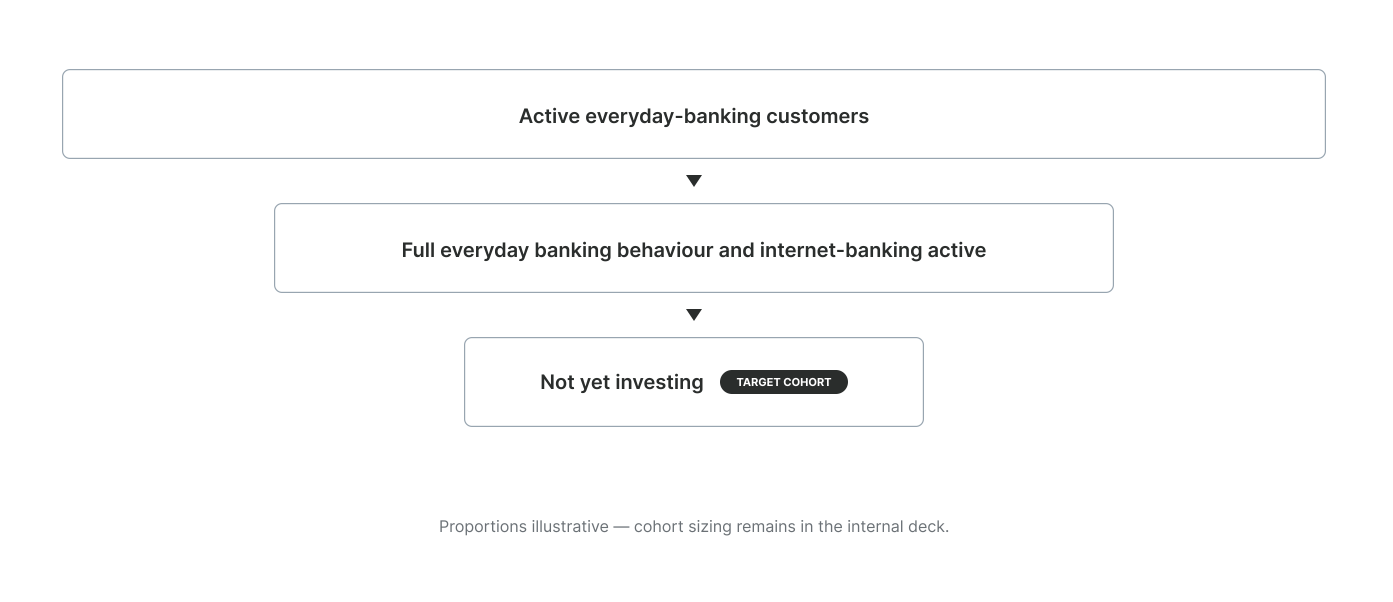
Fig 03
RECREATED ARTEFACT
Opportunity funnel: Narrowing from all everyday-banking customers to the cohort with every signal of readiness and no first step taken.
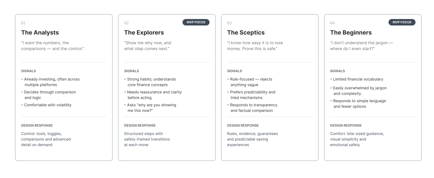
Fig 04
RECREATED ARTEFACT
Investor mindset: Four investor mindsets from the everyday-banking study. Two were chosen for the MVP; the other two were deliberately deferred.

Fig 05
RECREATED ARTEFACT
Behaviour change framework: Eight experience moments across three customer mindstates.
The design
The framework gave the team a shape to design against: motivate, reassure, choose. The redesigned calculator is where all three land in a single screen. It opens with the customer's own balance already filled in, so there's no blank form to abandon. It shows what saving alone does next to what a modest amount of growth does — side by side, never as a replacement. And it hands over the mix as a dial rather than a decision, so a first step can be as small as the customer wants it to be. The screens below trace that journey from cohort to choice.
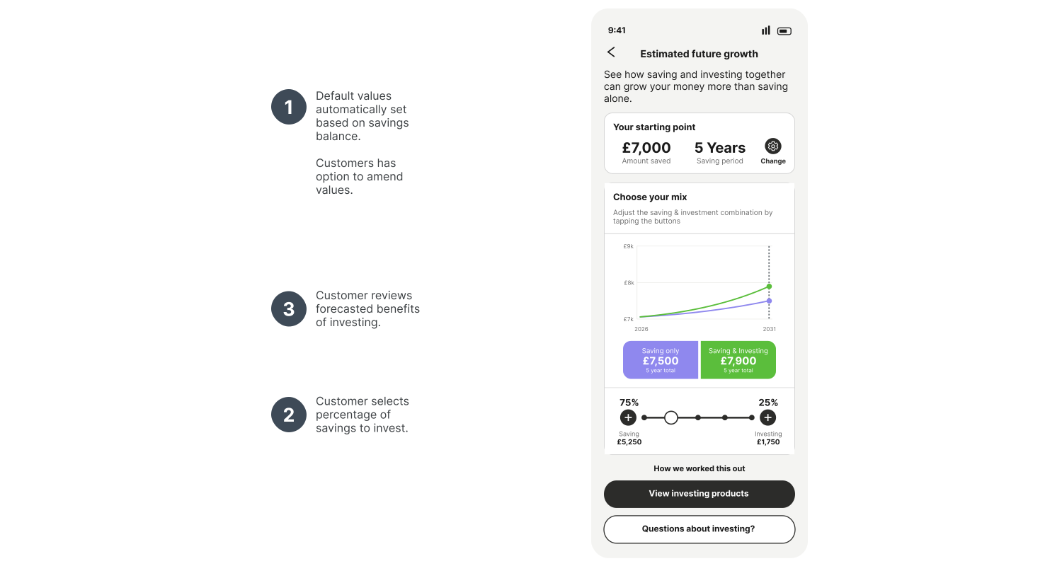
Fig 06
RECREATED ARTEFACT
Calculator design: the redesigned calculator, opens with the customer's own balance already filled in rather than a blank form.
What shipped & what happened
The MVP is scoped for delivery in 2026, with the direction signed off at design critique and presented to senior stakeholders in April 2026. The existing calculator is running ahead of its year-to-date targets, and a related guidance feature has launched inside the bank's investment guidance tool. Figures for both are withheld. What's not yet known: post-launch conversion once the redesigned calculator and hybrid framing go live — the project's real test.
What I'd do differently
Push harder, earlier, to instrument the current calculator properly. The compelling drop-off numbers behind this project came from existing analytics rather than anything built for it — the same gap will make it harder to prove the redesign's impact cleanly once it ships.
Some artefacts are shown at reduced fidelity, others redrawn. Figures are illustrative.