Premier Banking Experience
A customer doesn't meet nine channels. They meet one company.
Twenty-one quantified opportunities became a funded backlog and set the following year's roadmap.
Theme: customer experience
Role: Lead designer
Status: recommendations adopted
2025

Fig 00
SCREENSHOT
Everything a Premier customer sees, from the first advert to the card arriving. Other teams made these pieces. Bringing them into one view was my job.
Where this started
A small minority of the bank's customers held a disproportionate share of its balances and generated many times the income of a typical customer. Their banking experience was identical to everyone else's — and two attempts to change that had already failed.
The first marked them as a segment, at around £75,000 earned or held, and built them tools: a savings and investment dashboard, a calculator, savings goals, a net worth view. The second, 360, wrapped a benefits layer around the same flag and enrolled people automatically, in its own corner of the app.
Premier was the third attempt and the first to be an actual banking product — £100,000 eligibility, applied for, paid for. I designed the first of them — the mass-affluent tools — in 2023. When the bank launched Premier in 2025, its own announcement named an in-app net-worth calculator and a financial planning hub among the features. Those are the descendants of the tools I designed in 2023.

Fig 01
RECREATED ARTEFACT
Customer commercials: Why the segment mattered — proportions shown, figures withheld.

Fig 02
RECREATED ARTEFACT
Customer engagement: Four benefit propositions competing for one customer — the diagnosis that made the case for replacement.
My role / the team
I owned the experience; the proposition team owned the proposition. I created an end-to-end experience map, covering nine customer channels across the full customer lifecycle, in one view. It's where the gaps between channels became visible for the first time.
The call
The default boundary would have given me the app and left the billboard, the welcome letter, the debit card and the benefits partner to other teams. Everyone would have designed well inside their own lane, and the customer would still have met a company that couldn't keep its story straight — which is precisely what 360 had just demonstrated.
So I argued the boundary was drawn in the wrong place, and built the artefact that made a different one real: an end-to-end map joining advertising, web, app, email, in-app promotions, benefits, print, letters and the debit card across the full lifecycle.
Two decisions made it useful rather than decorative. It was built from production assets rather than concepts — slower, less flattering in a review, and the only way each team could find its own work in it. And it covered the stages nobody owns: what happens after someone joins, and what happens when they leave.
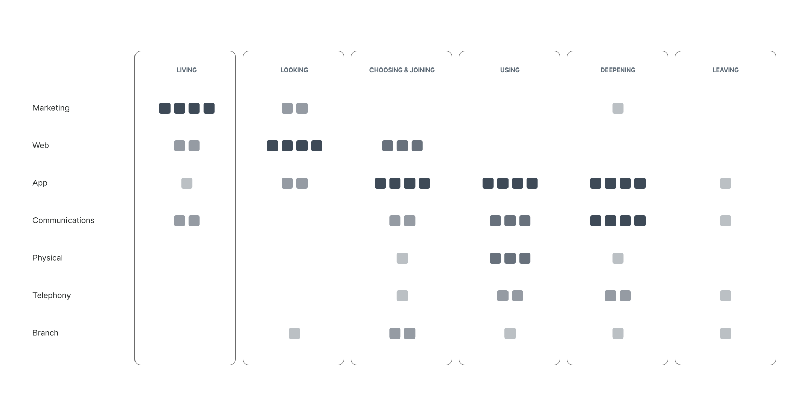
Fig 03
RECREATED ARTEFACT
Total experience map: The map's structure — where customer channels concentrate, and where whole lifecycle stages had nobody designing them.
The judgment calls
Diagnose the confusion as structural, not screen-level. The safe option was incremental: fix the hub's worst friction and keep the sunk investment working. No amount of UI polish fixes a proposition customers can't retell. I built the end-to-end view, and it showed the confusion wasn't in any single screen — it was structural, four overlapping stories about what the product was and who it was for. That diagnosis is what the replacement decision was made from. The decision itself was commercial and wasn't mine: trading away the cheaper path and accepting the cost of migrating existing customers was the bank's call to make.
Make one idea survive nine customer channels. Premier could never win as "Classic plus more benefits" — the comparison table framing is exactly what made 360 illegible. The proposition and brand teams set the emotional territory: recognition — the "you earned it" line. My judgment call was a different one: making somebody else's single idea survive contact with nine customer channels, so it still read as the same promise on a billboard, a welcome pack, a debit card and an app screen. What was traded away: prominence for individual benefits, some of which were deliberately underplayed at launch. What was gained: a proposition customers could repeat in one sentence, and a shared design language — three experience principles the teams aligned on together, mapped to the bank's premium brand direction that every channel could execute against.
The design
No single team could see the whole. The campaign was made by brand, the app screens by the product squads, the emails by comms, the card pack by physical, the branch materials by another team again — each one working well inside its own lane, to its own timeline. I built the board that put every piece of production work in one place: seven channels down the side, six stages of a customer's life across the top, and every asset that actually existed dropped into the cell where a customer would meet it.
That turned a coordination problem into a design one. Once the real work sat side by side, the joins became visible — where the tone shifted between a billboard and a welcome email, where two teams had solved the same moment twice, and where a customer crossed from one channel to the next with nothing carrying them. My job from there was less about making screens than about making the seams hold: reviewing what each team was producing against the whole, feeding the gaps back as design work, and keeping one promise legible from the first ad to the fifth month of holding the account.

Fig 04
SCREENSHOT
The Premier experience map: every production asset across seven channels and six stages of a customer's life, in one view. Shown at reduced fidelity — this is the working board, not a redrawn diagram.
What happened
Premier launched in 2025 across app, web, branch, telephony and a national campaign. It scored above four stars out of five for satisfaction, with near-universal ease scores, and the planning hub rated highest of any feature — the hub whose first version I designed in 2023. Those are the product's numbers, earned by the teams who built and ran it.
What the map changed is mine. Twenty-one opportunities, quantified and grouped by stage of the customer's life with the bank, went to the governance board that tracks experience work. They became a funded backlog, and they set the following year's roadmap.
One of those opportunities was only visible from the cross-channel view: an offer designed to get people to move their main current account, sitting below the fold where almost nobody reached it. Moving it drove double-digit uplifts in click-through and in sales. No single channel team could have seen it, because no single channel team could see the whole.
From map to roadmap
The map gave us the shape of the experience. The service blueprint, which I contributed to rather than owned, went a layer deeper — tracing the lifecycle stage by stage and marking every point where the experience stopped feeling premium. Where effort spiked. Where people dropped out. Where a promise made in one channel wasn't kept in another.
That analysis became the input to a cross-platform opportunity brief I co-authored with the proposition lead: twenty-one opportunities, each quantified against support-call volumes, drop-off rates and conversion gaps, and grouped by lifecycle stage rather than by team.
Framing them as opportunities rather than defects was the part that made it work. Channel owners could pick up the ones that belonged to them without it reading as a report card on their area.
What I'd do differently
Push the map earlier. By the time it existed, several channels had already committed to their own plans, and a map is far cheaper as a planning instrument than as a diagnosis.
And design the measurement in from the start. Too much of the evidence had to be reconstructed afterwards from support-call and chat data rather than instrumented on day one.
Some artefacts are shown at reduced fidelity, others redrawn. Figures are illustrative.